English Index of Multiple Deprivation, rebased for London (2025)
Last updated: December 2025
Next update: TBC
What does this indicator show?
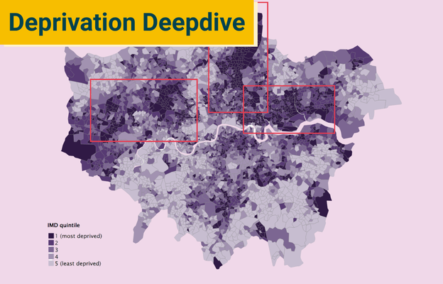
This indicator maps relative deprivation in London’s neighbourhoods. We can use it to quickly see the most and least deprived parts of London. It uses the overall Index from the English Indices of Deprivation.
For this indicator, we have excluded all non-London neighbourhoods from the rankings and divided them into five equal groups - known as quintiles. This allows us to quickly see how deprivation maps across London, rather than nationally.
The darkest areas of the map show London’s most deprived areas - the lightest areas are the least.
What is the Index of Multiple Deprivation (IMD)?
The IMD is a dataset produced for the government. It brings together data across seven different categories, called ‘domains’. They are:
- Income – e.g. how many people are on a low income
- Employment – e.g. how many people are unemployed
- Education – e.g. lack of qualifications
- Health – e.g. risk of premature death
- Crime – e.g. risk of being a victim to crime
- Barriers to housing and services – e.g. affordability of housing and local services
- The living environment – e.g. air quality and green spaces
By combining these seven domains, the IMD gives every neighbourhood a score. Using this score, each neighbourhood in England is then ranked from most deprived to least deprived.
The index is one of the most widely used tools for understanding where deprivation concentrates, and it plays a direct role in shaping how public money is allocated.
What does the IMD tell us about deprivation in London?
From our map, we can see that London is a patchwork of deprivation. In every borough, neighbourhoods with vastly different levels of deprivation are pushed up against one another.
The Index of Multiple Deprivation (IMD) gives us the fullest picture of what deprivation looks like across neighbourhoods in England. It contains a huge amount of information.
To make the IMD easier to digest, we've split our analysis into five short parts, each focused on a different aspect of deprivation in London. Explore them below.
-
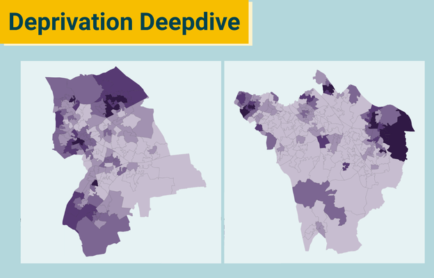
Deprivation deep dive (1): London's clusters of deprivation
-
Deprivation deep dive (2): The hidden inequality within 'less-deprived' boroughs
-
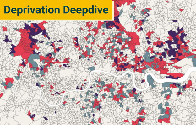
Deprivation deep dive (3): London's most deprived neighbourhoods haven't shifted
-
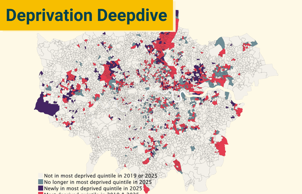
Deprivation deep dive (4): Where have we seen the biggest changes?
-
Deprivation deep dive (5): Why the IMD underestimates deprivation in London
Explore the IMD's sub-domains
As well as providing an overall score for each neighbourhood, the IMD gives a score for each of its seven sub-domains.
You can explore maps for each of the Indices of Deprivation's seven domains below.